
Science 37
Native app designed to help people take control and own their health records.
Project Info: Mobile Application
Tools: Whiteboard, Pen & Paper, Sketch, Invision
My Role: Project Manager & Lead Researcher
Timeline: 2 Weeks
Team: Jason Nashime, Isaac Park, Eugene Kim
Deliverables:
User Research, User Persona, C&C Analysis, Journey Map, User Flow, Sketches, Wireframes, Usability Tests, Clickable Prototype
OVERVIEW
INTRO
Science 37 is a clinical research services and technology company located in Los Angeles dedicated to making the clinical trial experience better for patients. By improving the patient experience, they aim to advance treatments, medications, and technology in the health field.
CHALLENGE
Although the adoption of Electronic Health Records (EHR) has advanced the protection of patient information and improved efficiency, constant data breaches and miscommunications has left patients feeling insecure about the safety of their records and the quality of their care.
SOLUTION
Putting the control over health records in the patient's hands. Design a patient-centered app that utilizes blockchanin technology to allow patients to own their health records, store them securely, and access whenever they want and whenever they need.
DISCOVERY
GETTING TO KNOW THE USER
The first step in my research was to conduct user interviews to learn about the current healthcare landscape. In order to understand the needs and pain points affecting the space, I decided to interview both patients and physicians to gain valuable insights


"Sometimes there are multiple charts for the same patient that causes confusion"
- Physician
"How can my doctor be giving me the best treatment without knowing my whole history?"
- Patient
LEARNING THE LANDSCAPE
Another layer of our research included a Comparative and Competitive Analysis to familiarize ourselves with the common features and best practices of healthcare companies in the field. I evaluated several leading sites that all shared a common thread; use of technology to excel in a particular area of the patient experience.

RESEARCH SYNTHESIS
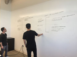
MAKING SENSE OF THE DATA
The data we gathered was then analyzed using an Affinity Map to draw out common trends and key themes. One pattern that really stood out was an overall dissatisfaction and frustration with the current record management system from patients AND physicians.
 |  |
|---|---|
 |  |
 |
From our research we discovered the following pain points between patients and physicians:
1. Control and accessibility of records
2. Poor communication with healthcare professionals
3. Lack of security surrounding record management

RESEARCH FINDINGS
RE-SCOPING
At this stage of the design process our team ran into a pivot in regards to scope. Initially our research empowered us to improve both the patient and physician experience but the agile nature of our project pushed us to re-examine our scope and focus.
Through additional interviews and research we determined that by improving the patient experience, we would also help physicians accomplish their central goal; to provide the best care for their patients!
WALKING IN THEIR SHOES
Based on our research and user interviews, I created a user persona to help make design decisions based on the needs and goals of our intended user. By stepping into “Ken’s” shoes, we were able to stay persistent in aligning with what was most important to our users and solve their biggest frustrations.

TRACKING A PATH
With the use of a Journey Map, the team and I were able to track Ken through a common scenario of requesting his records to be sent from his doctor to his specialist before his scheduled visit.
The Journey Map helped in visualizing the highs and lows of Ken's experience interacting with the current EHR system.

DESIGN STRATEGY
BUILDING CONTEXT & IMPROVING NAVIGATION
Armed with key pain points and a strong understanding of the end user, we used a Feature Prioritization Matrix to map out which features would have the highest impact with the lowest complexity.
 |  |
|---|---|
 |  |
 |
Our team was able to once again re-scope and narrow our focus by determining the MVP that could immediately improve the patient experience. This second pivot and this new discovery actually helped to improve and simplify the solution.
RE-SCOPING... AGAIN
While plotting out our Feature Prioritization Matrix we realized that the communication features we had originally designed for our app would be unrealistic to develop when considering time and cost.
KEY FEATURES
Once we narrowed our focus to create a solution that would immediately improve the patient's experience, we landed on the following key features:

As we began looking at elements such as portability, convenience of scanning your records using your phone, storing & quickly accessing records, and added levels of security, we determined that a native app would best accomplish the user's needs and goals.

'HAPPY PATH'
With our platform decided, key features determined, and our new scope in hand, I created a new user scenario and mapped out a User Flow to understand the ideal user path and to also uncover any potential gaps in the flow.

IDEATION
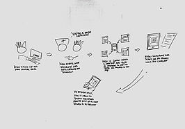
STORYBOARD TO WIREFLOW
I created a storyboard to help illustrate an encounter and the actions that a user would take when using the app. From the storyboard, the team I started ideating on possible screens and UI elements.

SKETCHES TO HI-FI
Starting with low-fidelity sketches, we ran through several iterations of medium-fidelity wireframes based on feedback we received through usability testing before arriving at our final clickable prototype.

Lo-Fi Sketches
Med-Fi Wireframes


Hi-Fi Wireframes


PROTOTYPE WALK-THROUGH
WHAT'S NEXT?
The next steps to execute this deliverable would be to continue collaborating with developers on fleshing out the key details of the app and to plan a build timeline.
Areas of discussion may include timeline estimates, frameworks to build on, code base, Android vs. IOS.
Wireframes with Annotations


REFLECTIONS
Through this case study, I was able to experience several new discoveries that led to strong design improvements to align even closer to the user’s needs. This project confirmed once again how important research and continuous testing is to the design process. The biggest takeaway that allowed for me to successfully accomplish this case study was exercising agile methods in being open to quickly adapt and change design decisions and re-adjust the scope to maintain the target user's needs as my true north star.
Working with a team also provided a great opportunity to collaborate with other designers and to share ideas while learning from each other's strengths. Strong communication and empathy played pivotal roles in this team project and led to a cohesive and effective partnership.