
RoverP6Cars.com
E-commerce website re-designed for an improved shopping experience for Rover P6 car owners
Project Info: E-Commerce Website
Tools: Sketch, InVision, Whiteboard, Pen & Paper
My Role: UX / UI Designer
Timeline: 3 Weeks
Team: Eugene Kim
Deliverables:
User Research, User Persona, C&C Analysis, Contextual Inquiry, Journey Map, User Flow, Site Map, Sketches, Wireframes, Usability Tests, Clickable Prototype
OVERVIEW
INTRO
Roverp6cars.com is an e-commerce retailer specializing in parts and services for Rover P6 automobiles. With over 20 years of experience, RoverP6Cars.com is committed to providing customers with affordable, quality parts to keep their cars running.
CHALLENGE
The busy, outdated look of the site and the varying page designs creates confusion with customers and leads to a lack of confidence in the products and shopping experience.
SOLUTION
Give customers confidence that they are buying quality parts from a reputable business. Re-design website with core categories, consistent page designs, and a more seamless checkout process so customers can easily find the parts they need and be assured of their shopping experience.
DISCOVERY
ON THE SURFACE
I began my research, by reviewing the current website to gain some insight into the types of products sold and the target audience. I discovered that aside from car parts, roverp6parts.com also provides instructional guides and news on group events. I learned that there is a strong community of Rover P6 owners who take pride and tremendous care in maintaining their car.


LEARNING THE LANDSCAPE
Going deeper into my analysis of roverp6cars.com, I used Nielsen's method to conduct a Heuristic Evaluation to assess the current user interface design and uncover any usability problems. I identified multiple violations with the strongest being consistency and aesthetics.
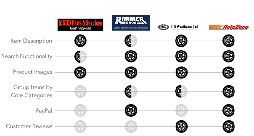
I then compared the website against other online retailers of P6 parts as well as a leading e-commerce site for general car parts; Autozone. Using comparative and competitive analysis, I was able to get a better gauge on the features and functions that are commonly used and recognized among online auto parts retailers.

PREPARATION IS KEY
With a deeper understanding of the current site, it was time to learn about the users. Using Survey Monkey, I created an online survey and pre-screened participants for user interviews based on their experience using an e-commerce site, buying car parts, and their knowledge of repairing cars. I then prepared interview questions and a task script as I felt it would be valuable to also observe the participants navigate through the roverp6cars.com site.

GETTING TO KNOW OUR USER
User interviews were conducted with the purpose to understand the experience users have when shopping for car parts, what their goals and needs are, and what makes for an enjoyable experience.
I then observed the participants and gained important insight as they attempted to purchase a part through the roverp6cars.com site.

RESEARCH SYNTHESIS
MAKING SENSE OF THE DATA
Data and insight from the interviews and observations were then charted on an Affinity Map to find common trends and patterns; the strongest being how appearance and design of the site and the confidence in the shopping experience.

RESEARCH FINDINGS
The following takeaways were discovered from my research:

RE-SCOPING
Initially, my plan was to re-design the pages for the different services and supplementary information provided on the site. Due to the limited timeframe, I adopted a lean design process and adjusted my scope to focus on designing a more confident shopping experience.
WALKING IN THEIR SHOES
With a deeper understanding and knowledge of the user from my research and interviews, I created a persona to guide my design decisions. By defining Harry’s habits and goals, I was able to continue my design process armed with the target user’s needs and motivations.

TRACKING A PATH
In order to identify the roadblocks and frustrations users may encounter, I used a Journey Map to track Harry through the process of logging in to the site, finding a part for his Rover P6, and then purchasing the item.
This also allowed me to recognize potential areas of improvement and design opportunities.

DESIGN STRATEGY
GETTING SPECIFIC
I then began forming a list of possible features and solutions and used a Feature Prioritization Diagram to narrow them down by which would bring the highest value to the user and be the most feasible.

RESEARCH FINDINGS
The decided features aimed to improve 3 key aspects of the site; look, navigation, and shopping experience.

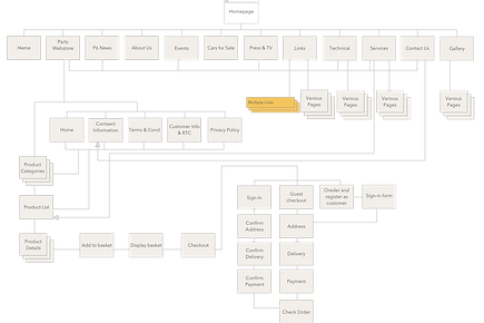
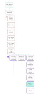
BUILDING CONTEXT & IMPROVING NAVIGATION
To improve the navigation and shopping experience, I diagramed the current sitemap and current checkout user flow. This provided a strong visual of the number of steps and choices that users were faced with throughout the site.
CURRENT SITEMAP
CURRENT CHECKOUT
USER FLOW
A card sort was used to create sensible category groupings and an improved information architecture. I constructed a wireflow of the checkout process and ran usability tests and iterated based on feedback.
 |  |
|---|---|
 |  |
IDEATION
SKETCHES TO PROTOTYPE
Wireflows opened the gates to additional sketches and I began ideating on UI elements. Ideas took form into wireframes and further testing with prototypes. The final high-fidelity clickable prototype was then tested with a few of my earlier interview participants. Their response, ease, and confidence when testing the prototype confirmed for me the design decisions I made to align with my assigned scope; to create a more confident and enjoyable shopping experience on roverp6cars.com.
Current Homepage
Lo-Fi Sketch

Med-Fi Wireframe


Hi-Fi Wireframes

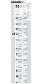
Current Product List
Lo-Fi Sketch

Med-Fi Wireframe

Hi-Fi Wireframes

Current Product Detail

Lo-Fi Sketch

Med-Fi Wireframe

Hi-Fi Wireframes


Current Shopping Cart
Lo-Fi Sketch

Med-Fi Wireframe

Hi-Fi Wireframes

Current Checkout


Lo-Fi Sketch
Med-Fi Wireframe

Hi-Fi Wireframes

PROTOTYPE WALK-THROUGH
WHAT'S NEXT?
The next steps in the process would be to work with developers to make the proposed changes outlined in my designs. I would use annotations to convey the details of each screen and functions of each UI element. I would work with developers to create a timeline and collaborate using Zeplin or another tool to best partner with developers to transfer and communicate my designs.
Wireframes with Annotations


REFLECTIONS
This was a great opportunity to execute the entire design process and to uncover the different facets that create a confident shipping experience. I was able to use an array of tools in both my research and design strategy. The biggest takeaway for me from this project was being able to see how much the appearance and navigation of a website can affect the user’s overall experience.